Toggle
Color
| Element | Property | Color token |
|---|---|---|
| Label text | text color | $text-secondary |
| Action text | text color | $text-primary |
| Background (off) | background-color | $toggle-off |
| Handle (off) | background-color | $icon-on-color |
| Background (on) | background-color | $support-success |
| Handle (on) | background-color | $icon-on-color |
| Checkmark | fill | $support-success |
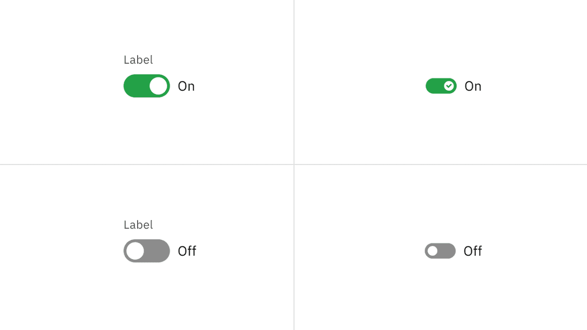
On and off toggle states
Interactive states
| State | Element | Property | Color token |
|---|---|---|---|
| Focus | Toggle | border | $focus |
| Disabled | Label text | text color | $text-disabled |
| Action text | text color | $text-disabled | |
| Background | background-color | $button-disabled | |
| Handle | background-color | $icon-on-color-disabled | |
| Checkmark | inner fill | button-disabled | |
| Read-only | Label text | text color | $text-secondary |
| Action text | text color | $text-primary | |
| Background | background-color | transparent | |
| Border | border | border-subtle * | |
| Handle | background-color | $icon-primary |
* Denotes a contextual color token that will change values based on the layer it is placed on.
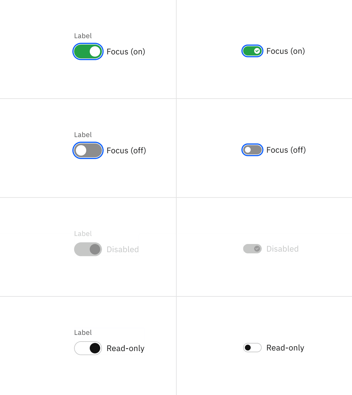
Interactive toggle states
Typography
Toggle labels should be set in sentence case, with only the first word in a phrase and any proper nouns capitalized, and no more than three words.
| Element | Font-size (px/rem) | Font-weight | Type token |
|---|---|---|---|
| Label text | 12 / 0.75 | Regular / 400 | $label-01 |
| Action text | 14 / 0.875 | Regular / 400 | $body-compact-01 |
Structure
Default toggle
| Element | Property | px / rem | Spacing token |
|---|---|---|---|
| Toggle | width | 48 / 3 | – |
| height | 24 / 1.5 | – | |
| Handle | height, width | 18 / 1.25 | – |
| Label text | margin-top, margin-bottom | 16 / 1 | $spacing-05 |
| Action text | margin-left | 8 / 0.5 | $spacing-03 |
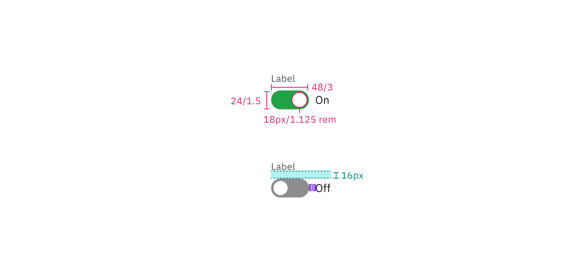
Structure and spacing measurements for default toggle | px / rem
Small toggle
| Element | Property | px / rem | Spacing token |
|---|---|---|---|
| Toggle | width | 32 / 2 | – |
| height | 16 / 1 | – | |
| Handle | height, width | 10 / 0.625 | $spacing-03 |
| Action text | margin left | 8/ 0.5 | $spacing-03 |
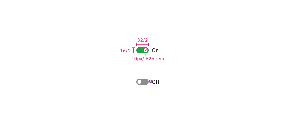
Structure and spacing measurements for small toggle | px / rem
Sizes
| Size | Height px / rem |
|---|---|
| Small (sm) | 16 / 1 |
| Default | 24 / 1.5 |
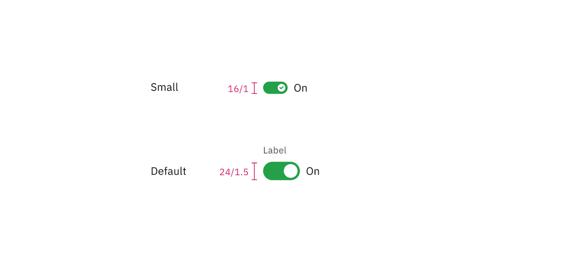
Toggle sizes | px / rem