Pagination
Pagination is used for splitting up content or data into several pages, with a control for navigating to the next or previous page.
Live demo
This live demo contains only a preview of functionality and styles available for this component. View the full demo on Storybook for additional information such as its version, controls, and API documentation.
Accessibility testing statusFor every latest release, Carbon runs tests on all components to meet the accessibility requirements. These different statuses report the work that Carbon has done in the back end. These tests appear only when the components are stable.
For every latest release, Carbon runs tests on all components to meet the accessibility requirements. These different statuses report the work that Carbon has done in the back end. These tests appear only when the components are stable.
Overview
Generally, pagination is used if there are more than 25 items displayed in one view.
The default number displayed will vary depending on the context.
Best practices
Identify the current page
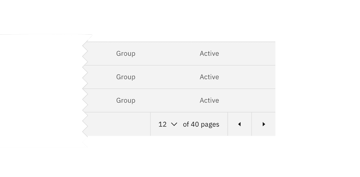
Clearly identify which page the user is on by displaying the current page number. By providing context into how many pages there are in total (eg. 1 of 4 pages), you can help provide clarity around the data displayed.
Provide various options for navigating
Previous and next chevrons or links are the most useful way for the user to move forward or backward through pages of data. Provide an inline select in which users can choose the page they wish to navigate to.


Items per page
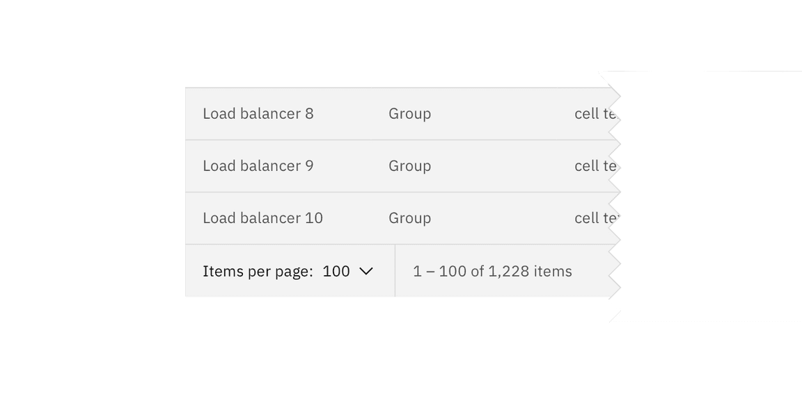
Use an inline select within the pagination bar so the user can change the amount of data displayed per page.

Feedback
Help us improve this component by providing feedback, asking questions, and leaving any other comments on GitHub.