Link
The following page documents visual specifications such as color, typography, structure, and size.
Color
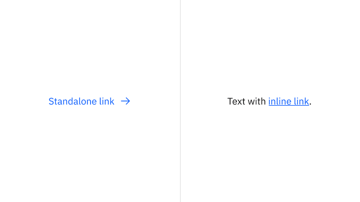
| Element | Property | Color token |
|---|---|---|
| Link | text-color | $link-primary |
| Icon | svg | $link-primary |
Interactive state color
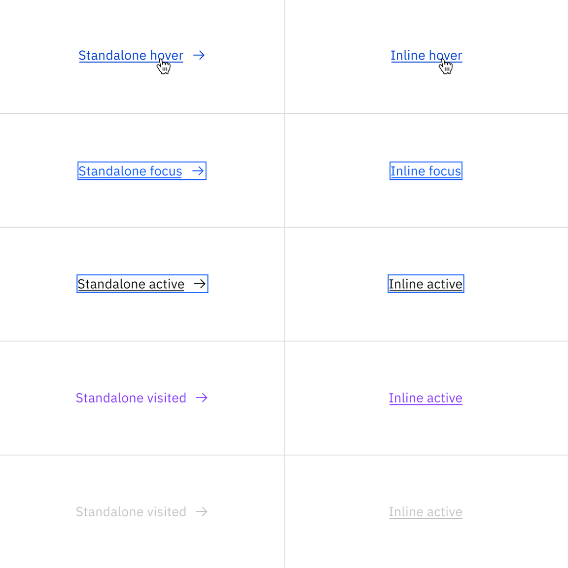
| Element | State | Property | Color token |
|---|---|---|---|
| Link text | Hover | text-color | $link-primary-hover |
| Focus | text-color | $link-primary | |
| Active | text-color | $text-primary | |
| Visited | text-color | $link-visited | |
| Disabled | text-color | $text-disabled | |
| Icon | Hover | svg | $link-primary-hover |
| Focus | svg | $link-primary | |
| Active | svg | $icon-primary | |
| Visited | svg | $link-visited | |
| Disabled | svg | $icon-disabled | |
| Border | Focus | border | $focus |
| Active | border | $focus |
Typography
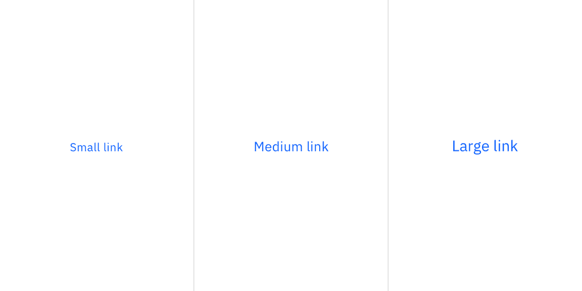
There are three sizes for links: small, medium, and large.
| Element | Font-size (px/rem) | Font-weight | Type token |
|---|---|---|---|
| Small | 12 / 0.75 | Regular / 400 | $helper-text-01 |
| Medium | 14 / 0.875 | Regular / 400 | $body-compact-01 |
| Large | 16 / 1 | Regular / 400 | $body-compact-02 |
Structure
There are three link sizes—large, medium, and small. However, the width of a link is determined by the length of the link’s text.
Links can be grouped vertically or horizontally. The following specs are not developed for the link component but are recommended by design as the proper distance between grouped links.
| Element | Property | px / rem | Spacing token |
|---|---|---|---|
| Link text | padding-right | 16 / 1 | $spacing-05 |
| padding-bottom | 4 / 0.25 | $spacing-02 | |
| padding-bottom | 8 / 0.5 | $spacing-03 | |
| Icon: small and medium link | svg | 16 x 16 | – |
| Icon: large link | svg | 20 x 20 | – |
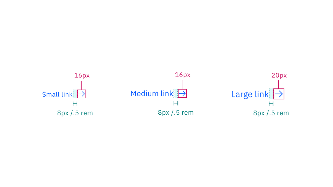
Structure and spacing measurements for Link with icon | px / rem
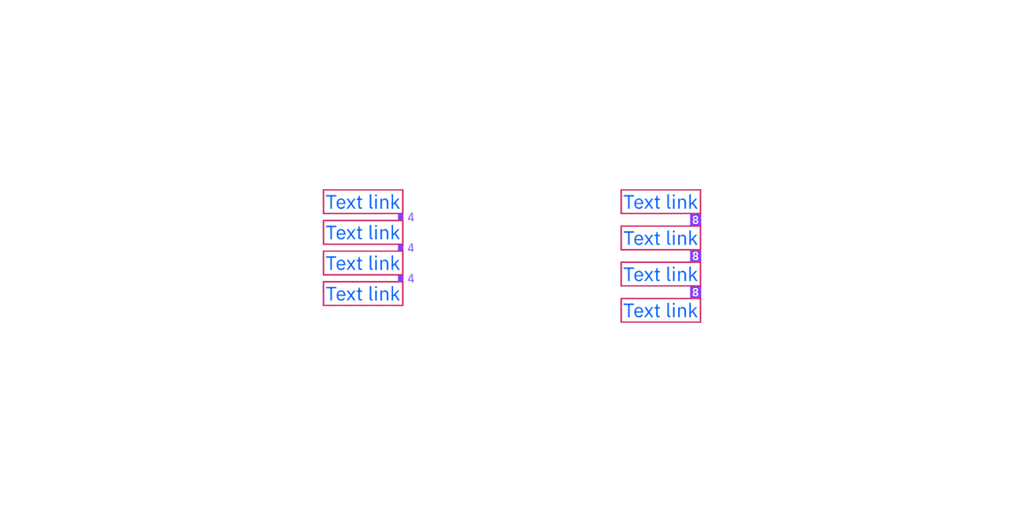
Structure and spacing measurements for Link grouping | px
Size
There are three fixed heights of links—small (16px), medium (18px), and large (22px).
| Size | Height |
|---|---|
| Small | 16 / 1 |
| Medium | 18 / 1.125 |
| Large | 22 / 1.375 |
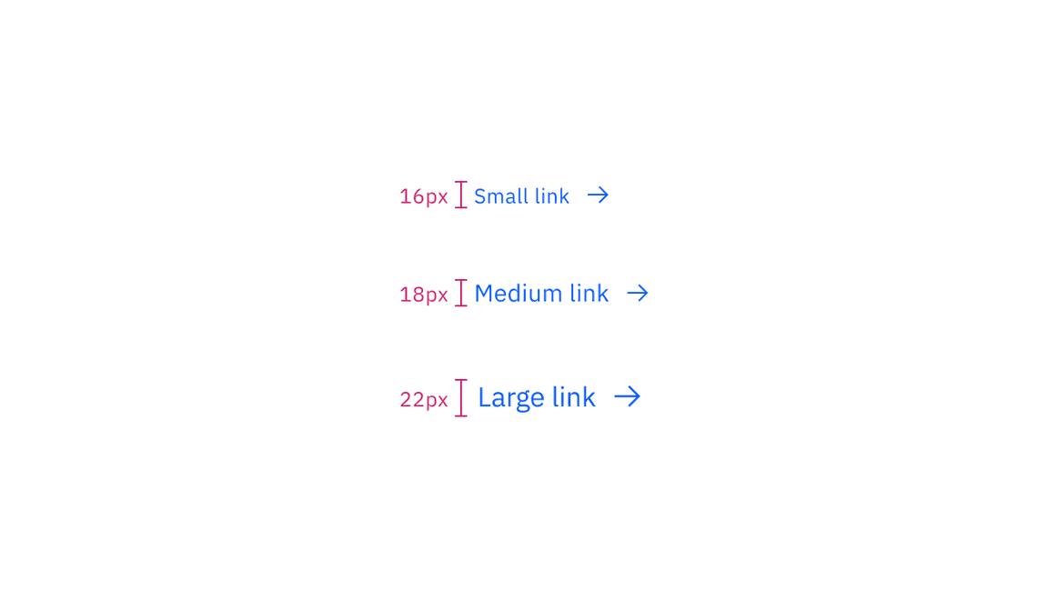
Sizing applies to both standalone and inline links
Feedback
Help us improve this component by providing feedback, asking questions, and leaving any other comments on GitHub.