Chart anatomy
The elements constructing each chart are designed to work in harmony. Each piece plays an important role in data communication.
Rectangular charts
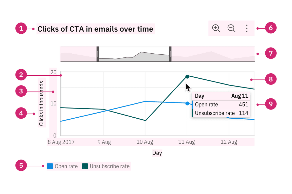
Most data visualizations are rectangular charts, with two dimensions represented on a vertical and a horizontal axis. Rectangular charts are typically constructed with a set of common elements including a legend, axis titles, and navigation tools like a zoom bar and tooltip.

Titles, labels, and legends
The title of a piece of visualization should be descriptive and qualitative. It should also reflect the main insight the data reveals. The legend should explain the chart’s meaning by defining the association of each visual property, such as color, shape, and size, to the corresponding data. When possible, use labels directly on the chart to avoid long legends. All the text should be concise and easy to understand. Read more on legend usage.
Tooltips
A tooltip is a message that appears when a cursor is positioned over an element, such as a data point, icon button, or truncated text. By default, tooltips show on hover to reveal more detailed information or context for specific chart elements. A tooltip should repeat the corresponding values of the data point on both axes and any other relevant details.
Graph frames, axes, and ticks
The graph frame is the area where the data will be visualized as graphics or numbers. Axes, ticks, and the grid should help the reader understand the proportions and scale of the data, the indicators involved, and their unit of measure. Avoid filling the chart frame with too many elements, as it impacts the user’s ability to interpret the data. Read more on axes usage.
Circular charts
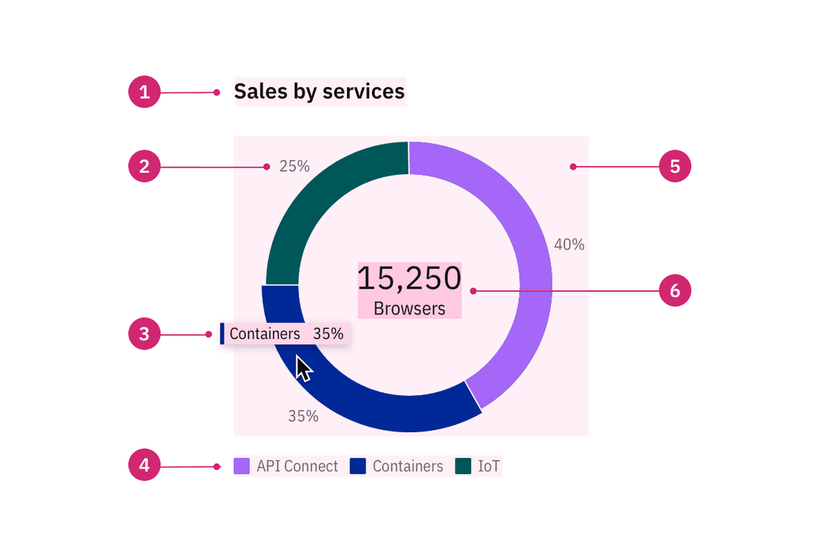
Circular charts are primarily pie and donut charts. Other circular layout charts include radar and solar charts.

Labels
In a circular chart, labels offer the percentage value of the whole for an individual category. When the graphic translation of the data is less than 3 degrees, a callout is used to clearly associate the label with the slice. If the data translates as less than 1 degree, a slice will not be rendered on the chart, the data would not be keyboard accessible or available in a tooltip either. The only way to see the data in this scenario would be via a data table, a feature that we’d like to implement for all charts to enhance accessibility.
Big number or KPI
A key performance indicator (KPI) consists of a number with a single word description. Examples include “15,250 browsers”, “$1.3M revenue”, or “Total 450”. A big number inside the donut chart may be used to display a total sum or the individual count of a slice upon interaction. This element can also be used independently on a dashboard (though please note this component is still a WIP and not available outside the donut chart).